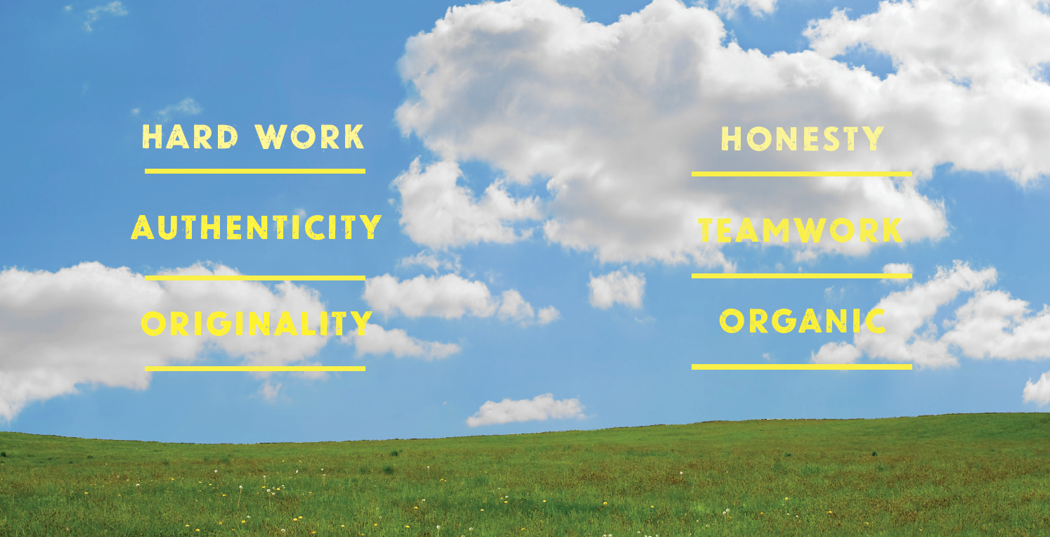
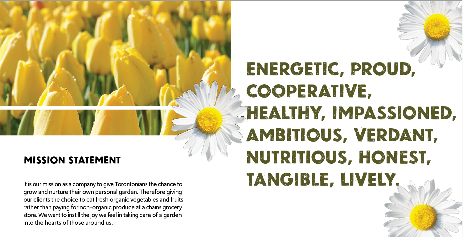
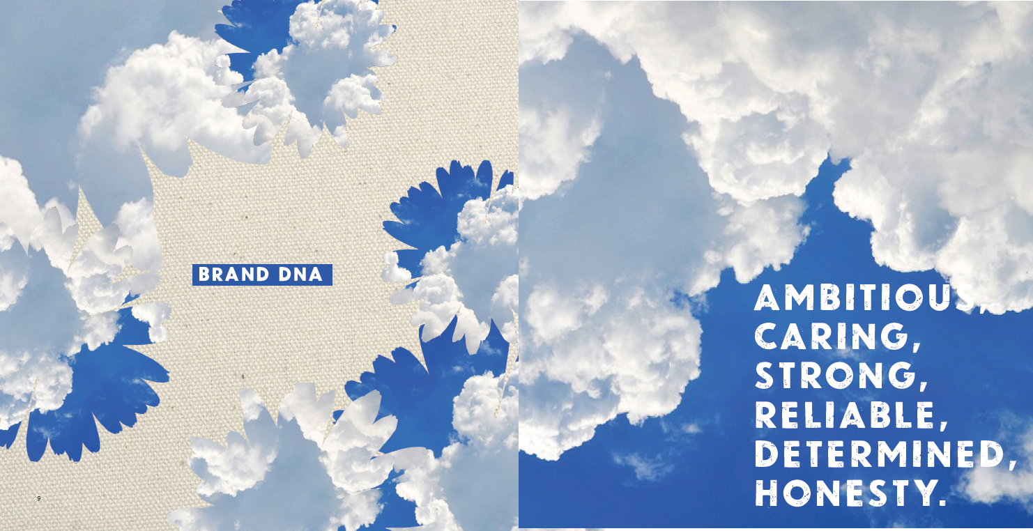
This is a branding assignment I created in the spring of 2019. The premise of the exercise was to create a company's identity, from brand story to brandmarks. I also included spreads from the final brand book. (photographs used in design are not my own, everything else is mine)
City Garden simplified brandmark
City Garden stamp
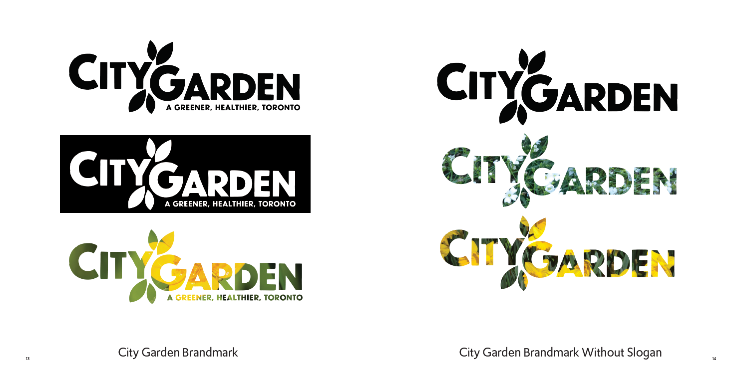
City Garden brandmark with slogan
City Garden brandmark without slogan
I created many iterations before deciding on these four designs. I wanted to show versatility in my brand, as some would be used for print, while others like the stamp would be used as an actual stamp for crates or packaging. I chose Newcastle as my font as I thought it was both friendly and strong in energy which suited my brand.
SPREADS


Products
In This project I made an effort to push myself to create as much as I could for the brand. I enjoyed the process of researching competition and finding a niche that was marketable. My brand's key words were Urban, Organic, and Authentic, and that is what I decided to put across in my design.
